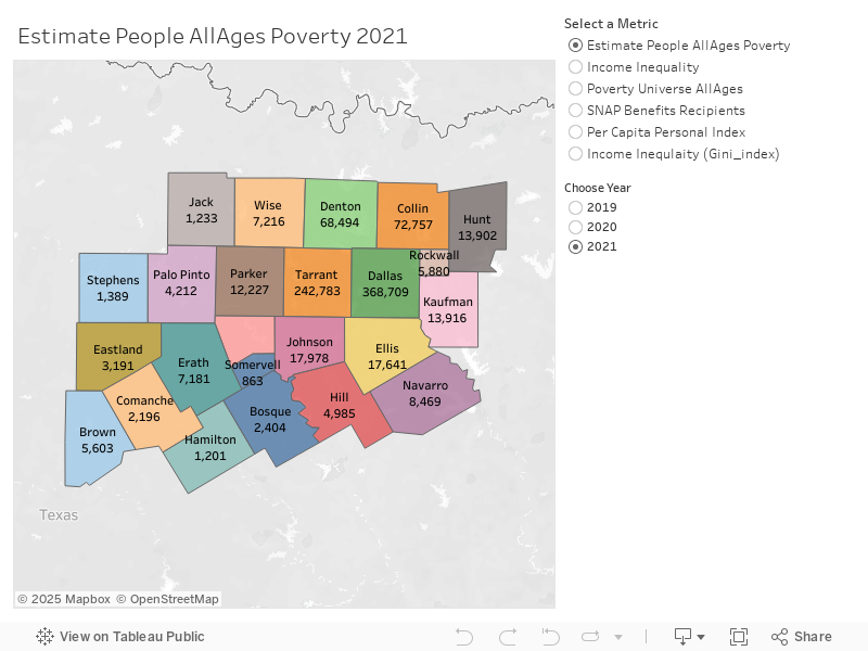
Socioeconomic Indicators: Poverty, Income and Benefits in NCT (2019-2021)
This provides a comprehensive visual analysis of key socioeconomic metrics across 24 counties. The interactive map and filters allow users to explore trends and variations over three years, from 2019 to 2021. Here’s a detailed breakdown of the dashboard’s components:
🌍 1. Geographic Visualization
• The main map highlights 24 counties, with each county color-coded based on the selected metric. The labels show the corresponding values, making it easy to compare counties at a glance.
• Users can select different metrics and years to see how socioeconomic conditions have changed over time.
📊 2. Key Metrics Available
The dashboard allows users to explore the following metrics:
- Estimate People All Ages Poverty:
o Shows the estimated number of people living below the poverty line in each county.
o Useful for understanding the extent of poverty and identifying counties with higher needs for assistance. - Income Inequality:
o Measures disparities in income distribution using the Gini index.
o A higher Gini index indicates more inequality within a county. - Poverty Universe All Ages (Currently Displayed):
o Represents the total population considered for poverty estimation.
o This metric helps contextualize poverty estimates relative to the overall population. - SNAP Benefits Recipients:
o Displays the number of individuals or households receiving Supplemental Nutrition Assistance Program (SNAP) benefits.
o This reflects the level of food assistance needed in each region. - Per Capita Personal Income:
o Indicates the average income per person in each county.
o This metric helps assess the economic well-being of the population. - Income Inequality (Gini Index):
o A specific measure of income disparity within each county.
📅 3. Yearly Comparison (2019, 2020, 2021)
• Users can choose between the years 2019, 2020, and 2021 to observe how each metric has changed over time.
• This feature allows for trend analysis, helping to identify socioeconomic improvements or areas that need attention.
📈 4. Insights and Observations (Based on the Current Map)
• Dallas County has the highest population under the “Poverty Universe All Ages” metric, followed by Tarrant and Collin counties.
• Smaller counties like Jack, Hamilton, and Somervell show significantly lower numbers, reflecting their smaller population size.
• Income inequality tends to be more pronounced in urbanized counties like Dallas and Tarrant compared to rural counties.
🎛️ 5. Interactive Features
• Metric Selector: Allows users to switch between the six available metrics.
• Year Selector: Enables comparisons across 2019, 2020, and 2021.
• Map Interaction: Users can hover over counties for detailed information.
📜 6. Purpose and Use Cases
• This dashboard is valuable for policymakers, researchers, and community organizations aiming to:
o Identify areas with high poverty and inequality.
o Allocate resources efficiently for SNAP benefits and other support programs.
o Track progress and socioeconomic changes over time.
o Advocate for targeted interventions based on data-driven insights.
In conclusion, the dashboard provides a powerful tool for understanding socioeconomic conditions across counties, facilitating informed decision-making and strategic planning.
Values in Population Counts
Values in Percentages
