Life Expectancy by Ethnicity, Age Group, Location, and Year
Overall Key Insights
- Geographic disparity: Urbanized counties fare significantly better in life expectancy than rural counterparts.
- Racial disparity: Non-Latino Asians consistently enjoy higher life expectancy, while Non-Latino Blacks show significantly lower values.
- Age group variation: Younger cohorts (1–4, 5–9) reflect relatively higher expectancy, but declines accelerate in middle-to-older age ranges.
- Temporal stability: Across 2009–2019, life expectancy trends remain largely flat, with only minor fluctuations — suggesting limited progress in addressing disparities.
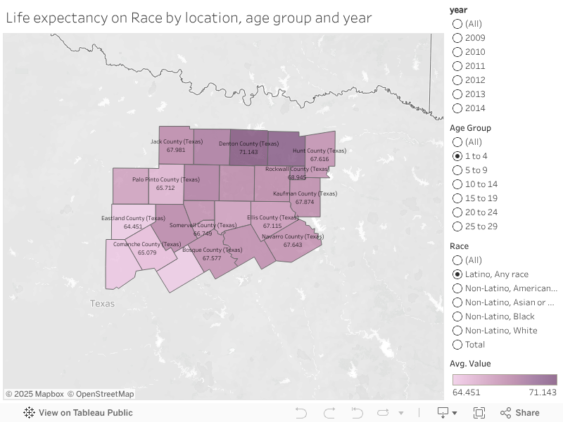
County Level Life Expectancy
- The county map provides a geographic view of life expectancy across the 24 North Central Texas counties.
- Values range between ~64.5 years (Eastland & Brown Counties) to ~71 years (Collin & Denton Counties), highlighting regional disparities.
- Age group and ethnicity filters allow users to analyze variations within specific demographics.
- Overall, urban counties (Collin, Denton, Tarrant) consistently report higher life expectancy, while more rural areas show lower averages.
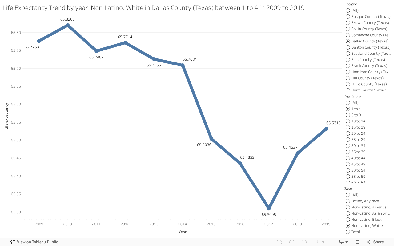
Trend by Year
- Focuses on life expectancy progression from 2009–2019 for selected ethnicity–age–county combinations.
- Example shown: Non-Latino White children aged 1–4 in Dallas County.
- Trend is relatively stable (~65.7–65.8 years in 2009–2011), dips to 65.3 years by 2017, and recovers slightly by 2019 (~65.5 years).
- This emphasizes how certain subgroups face stagnation or even decline in life expectancy compared to broader averages.
Bars by Ethnicity within Age Group (Ethnicity Comparisons)
- The bar chart allows direct ethnicity comparisons within a specific age group and county.
- Example: Dallas County, Age 5–9, Year 2017 shows:
- Non-Latino Asian or Pacific Islanders with the highest life expectancy (~67.16 years).
- Non-Latino Black population showing the lowest (~59.12 years).
- Other groups (Latino, Non-Latino White, Native American) cluster between 61–65 years.
- This highlights racial disparities in health outcomes, even within the same geography and age group.

Heatmap of Ethnicity × Age Group (Dallas County, 2017 Example)
- Presents a matrix-style breakdown of life expectancy values across both ethnicity and age groups.
- Patterns:
- Life expectancy decreases with age group consistently across races.
- Non-Latino Asians consistently top across all age groups, while Non-Latino Blacks consistently show lower values.
- Extreme disparities emerge at older ages, where the life expectancy gap between racial groups can exceed 10 years.
