Housing and Family Dynamics
Overview
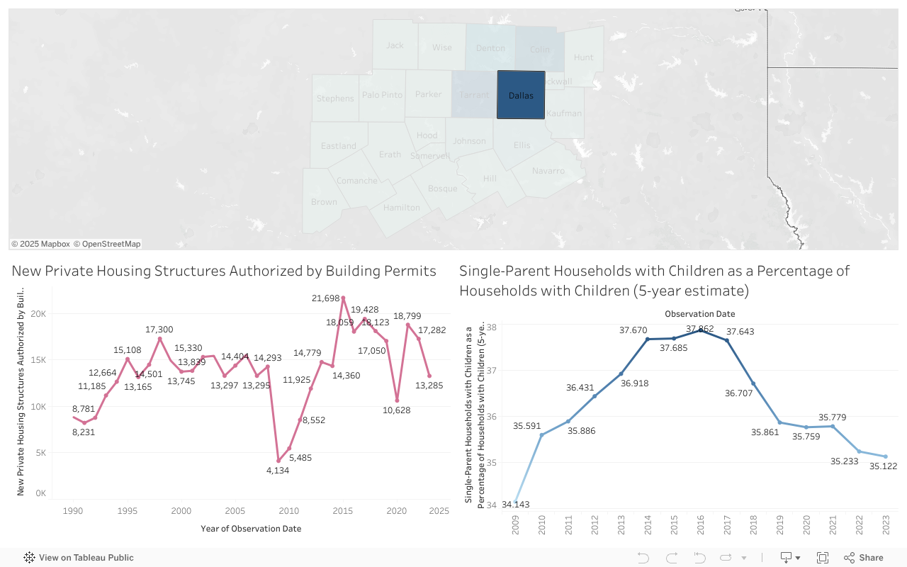
This interactive Tableau dashboard enables users to explore county-specific trends in North Central Texas by clicking directly on the map. Upon selection, the dashboard dynamically updates to show two key trend lines for the selected county:
Key Features
- Interactive County Map:
Users can click on any county to update the visualizations below. The map is color-coded to show comparative values (e.g., housing activity) across counties. - Trend Graph 1: New Private Housing Structures Authorized by Building Permits
This line chart tracks the number of new private housing structures authorized each year, reflecting construction and development patterns from 1990 to the most recent year. - Trend Graph 2: Single-Parent Households with Children (as % of Households with Children)
This chart provides insight into family structure dynamics by showing the percentage of households with children that are led by single parents over time. - Dynamic Filtering:
Clicking a county automatically filters both graphs to display data specific to that location, supporting focused, localized analysis.
Key Insights Unlocked by the Dashboard
- Housing Development Trends:
Identify growth spurts, construction declines, or recovery years in each county. - Family Structure Patterns:
Observe the stability or fluctuation in the proportion of single-parent households, which may reflect social, economic, or policy influences. - County-by-County Comparison:
Quickly compare urban vs rural counties by clicking through the map—dense counties (e.g., Dallas, Tarrant) may exhibit sharper fluctuations, while smaller counties show steadier trends.
Use Cases
- Urban Planning & Development:
Determine where new housing efforts are concentrated or lagging over time. - Social Services & Policy Making:
Monitor changing household compositions that may require targeted services or support programs. - Academic or Institutional Research:
Provide clean, county-level longitudinal data for researchers analyzing demographic or infrastructure change.
How to Use
- Click on a county from the interactive map.
- The two trend graphs below will instantly update to reflect data for the selected county only.
- Hover over data points for exact yearly values.
- Click another county to compare — no need to reset manually.