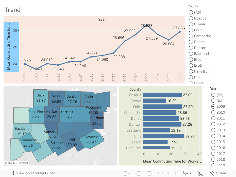
Mean Commuting Time Trends Across NCT Counties (2009–2023)
Dashboard Components:
1. Trend Line Chart (Top Panel)
- Displays the year-over-year commuting time trend from 2009 to 2023
- Shows the average across all counties, updating when a county is selected from the right filter
- Interactive: Use the County filter to view trends for individual counties
2. Geospatial County Map (Bottom-Left Panel)
- A filled map of North Central Texas counties
- Counties are shaded based on their Mean Commuting Time for the selected year
- Hovering displays exact commuting times
- County selection synchronizes the trend line above and bar chart to the right
3. Horizontal Bar Chart (Bottom-Right Panel)
- Compares Mean Commuting Times across all 24 counties for the selected year
- Helps identify outlier counties (e.g., highest and lowest values)
- Dynamic: Responds to year and county selection
Key Interactions:
 County Filter (Top-Right): View data for a specific county
 Year Filter (Bottom-Right): Changes year in map and bar chart
 Map Click: Clicking a county in the map updates all other views
- Tooltip shows precise values across all visualizations
Insights Example (2023):
- Highest commuting time: Kaufman County – 35.37 mins
- Lowest commuting time: Brown County – 19.19 mins
- Regional variation is evident, possibly influenced by population density, transportation infrastructure, or employment hubs
Purpose:
This dashboard helps transportation planners, policymakers, and regional analysts:
- Understand temporal commuting trends
- Compare commuting burdens across counties
- Identify areas needing transportation investment or policy attention