Access to Exercise Opportunities – Dashboard Summary
Overview
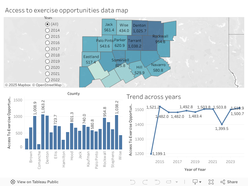
This dashboard visualizes the Access to Exercise Opportunities metric across the 24 North Central Texas (NCT) counties from 2014 to 2024.
The dataset reflects the percentage of residents with adequate access to walkable areas, gyms, parks, recreational centers, and other physical activity infrastructure.
This tool allows users to explore county-level differences, understand regional disparities, and track changes over time.
Dashboard Components
1. Interactive Map (Primary Filter)
The map displays the 24 NCT counties with color shading based on the current year’s Access to Exercise Opportunities score.
- Darker colors → Higher access
- Lighter colors → Lower access
Clicking on any county filters the bar chart and trend line to ONLY that county, allowing deeper review of local performance.
Demographics Context (County Profiles)
Although the dashboard focuses on exercise access, the 24 counties differ significantly in:
- Population size (from rural counties like Somervell & Hamilton to urban centers like Dallas, Tarrant & Collin)
- Urbanization (urban counties tend to have higher proximity to parks & fitness facilities)
- Median income levels (affluent counties show better infrastructure availability)
- Land area & density (rural counties often show lower percentages due to geographic spread)
- Health disparities (regions with higher poverty & limited transit tend to have lower access indicators)
These demographic factors help contextualize disparities seen on the map.
2. County Comparison Bar Chart (Current Year)
This bar chart allows a side-by-side comparison of all 24 counties for the selected year.
Key Patterns Observed
- Highest Access Counties:
- Dallas (~1063)
- Collin (~1008)
- Tarrant (~1038)
- Denton (~1025)
These are highly urban, high-population counties with extensive recreational facilities, structured city planning, and dense population centers.
- Lowest Access Counties:
- Comanche (~157)
- Hamilton (~293)
- Bosque, Hill, Eastland also remain on the lower end
These rural counties have fewer built facilities and larger land areas, resulting in lower access percentages.
3. Trend Across Years (2014–2024)
This line chart shows how Access to Exercise Opportunities has changed over time for:
- The entire region when no county is selected
- The selected county only when the map filter is used
Trend Insights
- 2014–2015 jump: Significant increase from ~1195 to ~1521 indicates rapid expansion of recreational access infrastructure.
- 2016–2021 stability: Values plateau around 1480–1503.
- 2022 decline: Noticeable dip to ~1399, potentially tied to:
- Temporary facility closures
- Pandemic after-effects
- Funding disruptions
- Population shifts
- Recovery in 2023–2024: Climbing back toward ~1510, suggesting reopening of public amenities and renewed investment.
How to Use the Dashboard
Map → Bar Chart + Trend Filter
- Select any county on the map
- The bar chart will highlight that county’s standing for the year
- The trend line updates to show that county’s performance from 2014–2024
- Clear selection to reset the view to all counties
Year Filter
Use the year selector to quickly examine any single year and see how counties compare.
Interpretation Summary
- Urban counties consistently outperform rural counties due to higher density of fitness centers, public parks, sidewalks, and transit connectivity.
- Rural counties show chronically low access, reflecting geographic barriers and resource limitations.
- Region-wide investment led to strong improvement from 2014–2015, followed by steady performance.
- The 2022 decline and 2023–2024 recovery indicate infrastructure reopening and renewed support after the pandemic.
- The dashboard allows policymakers, researchers, and public health decision-makers to identify where infrastructure gaps still exist and prioritize counties most in need.