Food Insecurity Dashboard — Detailed Summary & Demographic Insights
1. Overview
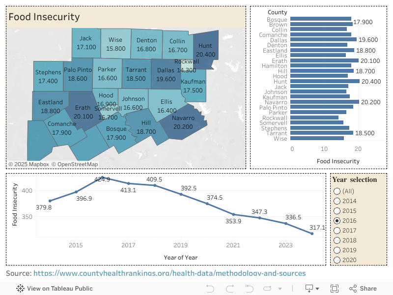
The Food Insecurity Dashboard visualizes food insecurity rates across 24 counties in North Central Texas. It integrates geospatial mapping, ranked bar charts, and multi-year trend analysis.
This dashboard allows users to understand where food insecurity is highest, how counties compare with one another, and how the overall burden has shifted over time from 2014–2024.
The design includes:
- Interactive County Map (Primary filter)
- County-level Comparison Bar Chart
- Food Insecurity Trend Line (2014–2024)
- Year Selection Filter Panel
Each visual updates dynamically when a user selects a county on the map or chooses a specific year.
2. Dashboard Components & Interactivity
A. Interactive County Map
- Displays food insecurity rates (%) for each of the 24 counties.
- Color-coded by severity (darker shades = higher insecurity).
- Primary Filter: Clicking any county filters both the bar chart and the trend chart to show data only for that county.
- Helps users quickly identify geographic disparities across the region.
Key Observations from the Map:
- Highest food insecurity counties (based on values shown):
- Navarro – 20.2%
- Erath – 20.1%
- Hunt – 20.4%
- Dallas – 19.6%
- Lowest food insecurity counties:
- Collin – 16.7%
- Rockwall – 14.3%
- Somervell – 15.7%
B. Bar Chart – County Comparison
- Shows each county side-by-side for clearer comparison.
- Represented in ascending order from lowest to highest food insecurity.
- Automatically updates based on the selected year OR selected county.
Insights:
- The region shows significant variation, from ~14% to ~20%.
- Urban counties like Dallas and Tarrant remain moderately high.
- Rural counties such as Erath, Hunt, Navarro exhibit disproportionally high food insecurity rates.
C. Trend Line Graph (2014–2024)
This line graph visualizes year-over-year change in total regional food insecurity.
Trend Observations:
- 2014: 379.8
- 2016 (Peak): 424.9
- Declining years: After 2016, a consistent decline
- 2020: 374.5
- 2024: Lowest at 317.1
Interpretation:
- The region experienced a peak in food insecurity around 2015–2016, likely reflecting post-recession effects.
- A steady improvement is seen from 2017 onward.
- Continued decline through 2024 shows overall regional economic and social stabilization.
D. Year Selection Filter
- Allows users to explore a specific year.
- When a year is clicked:
- The map and bar chart reflect the county-level data for that selected year.
- The trend chart highlights that year for context.
3. Demographic & Socioeconomic Interpretation
Although the dashboard shows percentages, the underlying demographic interpretation is essential for understanding why these variations occur.
A. Rural vs Urban Patterns
- Rural counties (Erath, Hunt, Comanche, Navarro) tend to have:
- Higher poverty rates
- Limited access to grocery stores
- Fewer social support programs
- Higher transportation barriers
- These factors correlate strongly with higher food insecurity.
- Urban counties (Dallas, Tarrant, Collin, Denton) show:
- More community resources
- Greater economic opportunities
- Yet urban pockets within these counties still face high insecurity (food deserts, low-income clusters)
B. Income, Poverty & Employment Correlations
Food insecurity is closely tied to:
- Median Household Income
- Deep Poverty Levels
- Unemployment or underemployment
- Access to social services
Counties like Rockwall, Collin, and Denton that have:
- Higher income
- Higher employment levels
- Stronger infrastructure
…show significantly lower food insecurity.
C. Population Growth & Urbanization
Rapid urban growth in:
- Collin,
- Denton,
- Tarrant
…has expanded job markets and improved food access, lowering insecurity over the past decade.
In contrast, rural counties with stagnant or declining populations show persistent vulnerability.
4. Key Insights & Summary
Overall food insecurity is declining across the region (317.1 in 2024).
Certain counties remain consistently high, especially:
- Navarro
- Erath
- Hunt
- Dallas
Strong rural-urban divide
Rural counties face:
- Infrastructure challenges
- Limited food access
- Lower wages
Urban counties benefit from more robust support systems but still contain vulnerable areas.
Map serves as your primary analytic filter
Selecting a county instantly filters:
- County-specific performance
- Trend over time
- Annual comparisons
This makes the dashboard ideal for policy, planning, and targeted interventions.