For other current projects see the web page for the Tarleton Computational Mathematics Research Group.
Dr. Kathy Horak Smith – Mathematics Education
Show More
Dr. Smith research mission is two-fold. I want to learn as much as I can about how students learn mathematics and how they acquire the academic vocabulary to communicate the mathematical concepts they have learned. I have two areas where my research occurs: public school classrooms and the college classroom.
Each summer, I work with two professors from Texas Christian University (TCU). We spend three weeks teaching summer school to rising fourth-sixth grade students in Fort Worth ISD’s Language Learning Centers (LLC) classroom teachers. The mathematics/science/language curriculum is not considered remedial, but an extension to the curriculum. The students enrolled in the summer school program have been in the United States less than three years and come from all over the world. This past year, our students claimed 21 different languages as their first language. We also involve classroom teachers, undergraduate and graduate students in the experience. This research group is involved in researching the acquisition of academic language in mathematics and science.
Specific areas that Tarleton State Undergraduate students are involved in include: use of word walls to teach academic language; use of graphic organizers to assess students’ problem solving ability; and the teaching scaling (scaling, ratio, and proportions) to fourth through sixth graders.
Predicting Party Affiliation Using Social Media
Show More

The past ten years have seen a dramatic increase in both the number of political online media sources and the appropriation of online media by political campaigns. The widespread use of Twitter, Facebook, and other social media sites for political purposes offer novel ways to quantify political affiliation and predict a litany of characteristics about online posters.
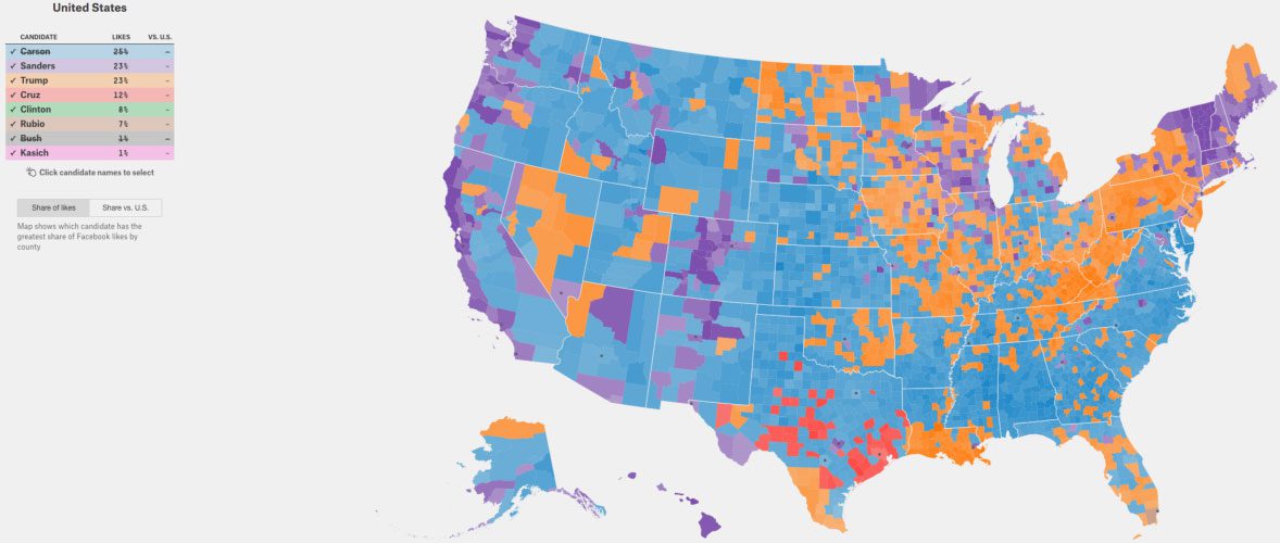
Incorporating data from social media profiles into traditional political analysis techniques has become a necessity for accurate polling and predictions for elections. For instance, the following map shows US counties colored by which 2016 Presidential candidate has the most Facebook likes in each county. In this project, Mikaela Jordan, Adam Swayze, and Joseph Brown applied text mining algorithms, including natural language processing methods, to build models for predicting party affiliation based on geotagged Twitter data.

Over 20,000 tweets pertaining to the primary elections were obtained by searching for certain key phrases, and a term-frequency matrix was built for predicting party affiliation using support vector machines, neural networks, and random forests.

Going forward, Mikaela, Adam, and Joseph plan to use social media to predict district-level outcomes in the 2016 national elections, while expanding the scope of their text mining algorithms to include information from online news articles, debate transcripts, and other sources.
Random Billiard Dynamical System Models for Gas-Surface Interactions
Show More
Chemical engineering problems require mathematical models for gas-surface interactions that are both rigorous and intuitive. Building on advances in billiard dynamical systems (theory) and GPU-based parallel processing (simulation), Mary Barker is helping develop particle-based models of gas-surface interactions free from continuum approximations. This allows her to study diffusion and thermodynamical processes in small-scale and rarified systems.
Mary has written a parallel algorithm using NVIDIAs CUDA architecture to simulate these systems. She is currently exploring the effects of particle size and density on thermal and density gradients, rate of heat flow, and entropy production rate. She also plans to use the algorithm to study thermophoresis (preferential drift of a large particle caused by non-uniform temperature environment), which has applications to carbon sequestration and pollution control.

Mary Barker with her faculty mentor, Dr. Scott Cook. Mary Barker presented at the 96th Annual Meeting of the Texas Section of the MAA, Nacogdoches, TX, April 2016.
Analyzing EEG Entropy for Predictions of Seizures
Show More

The onset of epileptic seizures can be predicted by examining changes in recorded entropy measures of electroencephalography (EEG) readings. Jonathan Stewart is working on detecting preictal EEG states (those immediately preceding a seizure) by applying data mining algorithms to changes in both the permutation entropy and wavelet entropy measures. The training data set for this project consists of 96 individual EEG time series, each containing 10 minutes of data sampled at 400 Hz, and half of these EEG sequences were labeled as preictal.
Taking the collection of time series obtained from each participant’s EEG readings, the measurements were binned into collections of 256 consecutive points in time each. The entropy measures were then applied to each collection of points, and a random forest model achieved accuracies over 90% for both the wavelet and permutation entropy measures. Jonathan’s next goal is to move into multichannel analysis using joint entropy measures and two dimensional wavelet transforms.
Finding an Optimal Game Theory Strategy Using Genetic Algorithms
Show More

David Ebert presented at the 96th Annual Meeting of the Texas Section of the MAA, Nacogdoches, TX, April 2016.
Fargo is a multiplayer dice game with a complex decision tree, and since the strategy space is so large, finding an optimal strategy using a direct search is not possible. David Ebert decided to approach this problem using genetic algorithms, where each strategy is represented by a gene vector, and better strategy vectors are obtained through stochastic natural selection of these genes. During each turn of this game, the active; player rolls 10 dice, scoring 100 n points for each triple nrolled (except 1000 points for three 1’s), plus an additional 100 points for each 1 rolled, and 50 points for each 5 rolled. After removing the scoring dice, a player must choose to either stop rolling and end their turn, or else continue rolling, risking their current points in hope of increasing their score.

Under certain conditions, a player’s turn can repeat, which results in the expected value equation being recursive, and solving this equation yields

The result of 100 genetic algorithm trials returned an optimal expected value of 962.33 with a strategy vector corresponding to aggressive play, as long as at least 4 dice remain. Continuing research will explore various ways to optimize the endgame, where expected value is no longer the most important factor, as a player strives to beat their opponents to 10,000 points.
Sentiment Analysis of Geotagged Tweets in Los Angeles County
Show More

David Ebert and Parker Rider are working with engineering professor Dr. Arthur Huang, applying sentiment polarity analysis techniques to geotagged tweets collected from Los Angeles county. After systematically cleaning the tweets and extracting a semi-supervised training set consisting of tweets with positive and negative emoticons, this semi-supervised set was used to evaluate four lexicons to see which one most effectively identified sentiment of tweets.

Afterwards, a normalized difference sentiment index was used to identify words from within the emoticon training set that are good indicators of whether a tweet is positive or negative.

This index was used to make a term-document matrix, over which a random forest classifier was trained. Preliminary results indicate that the random forest approach achieves significantly higher accuracy than the lexicon classifier.

David Ebert (left) and Parker Rider (right) with their faculty mentor, Dr. Arthur Huang (center).
Further research will explore ways to improve tweet cleaning and tune the classifier before applying the classifier to geotagged Los Angeles county tweets, using neighborhood sentiment scores to find out what neighborhood characteristics correlate to positive tweets.
Bayesian Ensemble Models of Climate Variability in South Texas
Show More

Possibly the most important application of data mining in the 21st century is building and refining models of climate change and then using those models to predict climate behavior in local regions. Juliann Booth and Nina Culver are using Bayesian model averaging to predict future precipitation in South Texas, an important concern, given the projected decline in water availability in this region by 2050.
Thirty-five CMIP5 models f1,…,f35 for temperature and precipitation were obtained from the World Climate Research Programme’s Working Group on Coupled Modeling. For each model fk, the probability of observing a temperature/precipitation measurement y is p(y|fk), and the probability that fk is the best model given observed target data yT is p(fk|yT). Synthesizing these two types of probabilities using Bayes’ theorem yields the overall probability of observing a future temperature/precipitation measurement y as follows.
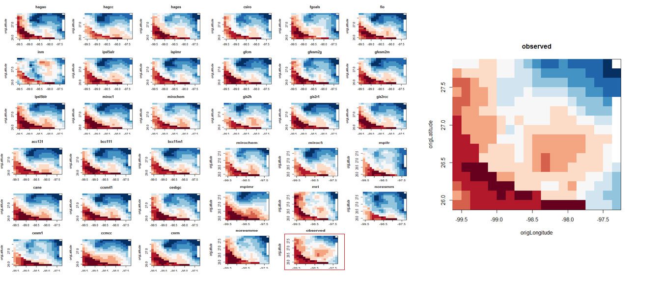
Here is a visualization of temperature predictions for the thirty-five CMIP5 models for the South Texas region being studied.
Modeling Nitrate Contamination in Water Wells Based on Proximity to CAFOs
Show More

Nitrate contamination of ground water is a serious health concern, which can lead to conditions such as methemoglobinemia (blue baby disease), miscarriages, and non-Hodgkin lymphoma, and the EPA has therefore set a maximum contaminant level (MCL) for nitrate of 10 mg/L. Proximity of concentrated animal feed operations (CAFOs) to water wells has been linked to nitrate contamination of those wells, and Charles Tintera and Lain Tomlinson are currently applying data mining techniques to model this relationship more accurately.
A novel feature of this project is modeling flowpaths in the aquifer from a given CAFO using the hydraulic gradient obtained from the Global Information System (GIS). By taking into account the distance from a well to a CAFO’s flowpath, the length of that flowpath, and the waste application rate at that CAFO, a CAFO Migration Score (CMS) is calculated to summarize the overall impact of CAFOs on the well under consideration. The Epanechnikov kernel is applied to model diminished probabilities of contamination that result from increased distances from the flowpath.
Once CAFO migration scores were computed, a logistic regression model demonstrated a highly statistically significant relationship between CMS and nitrate contamination (P = 7.19 x 10⁻¹²). In the image below, 344 wells have been broken into 10 deciles based on CAFO migration score, so each point in this plot represents approximately 34 wells. The x-coordinate of each point is the average CMS value for wells in that decile, and the y-coordinate is the observed number of wells in that decile with nitrate concentrations exceeding 3 mg/L. The plot indicates strong agreement between the observed data and the logistic regression model, as confirmed with a Hosmer-Lemeshow goodness of fit test.
Charles and Lain are now working to extend this analysis to include more variables, such as depth to water table, pH, total dissolved solids, percent clay, percent organic matter, and annual rainfall. They are also applying random forests, support vector machines, k-nearest neighbors, and other classification algorithms to improve the model’s classification accuracy. Because testing for nitrate contamination is expensive, the goal is to provide a tool that will help farmers estimate a well’s probability of being contaminated using readily available information about that well.
Effectively Using Data Warehousing to Store Nonprofit Data
Show More

Juliann Booth, Lain Tomlinson, and Parash Upreti presented at the 12th Annual Pathways Student Research Symposium, Corpus Christi, TX, October 2015. 2nd Place Master’s Presentation in Mathematics.
The Wilson County Fair originally began in 1919 in the city of Lebanon, Tennessee, moving to Wilson County in 1979. Since then, the fair has attracted hundreds of thousands of people, including last year, when 557,702 people attended. The current database used to schedule volunteers is inefficient with many duplicates, spelling errors, and lack of cohesiveness across the tables. Juliann Booth, Lain Tomlinson, and Parash Upreti used the concepts of primary keys, foreign keys, recursive relationships and third normal form to create a cohesive, less complex database that will decrease the occurrence of double-bookings.

Because this is a nonprofit organization working with volunteers only, it is imperative to keep the database as organized yet as simple as possible. After putting the database in third-normal form, an entity relationship diagram was created, resulting in many errors being caught and corrected. Still, Juliann, Lain, and Parash noticed that the database was not properly organized to accomplish the goal of scheduling the volunteers, so a new entity relationship diagram was created in order to optimize volunteer scheduling. The schematic below shows the original ERD, the modified ERD in third-normal form, and the modified ERD used to optimize scheduling.
Future work will focus on implementing improvements to the user interface and evaluating the performance of the improved database during the 2016 Wilson County Fair.
Detecting Anomalous Crop Insurance Claims using Satellite Images
Show More

Research assistants Rebecca Ator, Charles Gibson, Dan Mysnyk, and Adam Wisseman implemented a method for screening crop insurance claims for fraud using satellite images.
Using the difference between the red and infrared bands in a satellite image, it is possible to calculate the normalized difference vegetation index, or NDVI, which serves as a proxy for the amount of green vegetation in a given geographic region, and therefore, the health of crops being grown in that area. A k-means algorithm was applied to cluster NDVI curves for Nebraska crop insurance claims, resulting in a relatively healthy cluster (Cluster 1) and an unhealthy one (Cluster 2).
This clustering was then compared to spot checklist (SCL) flags, used by CAE to flag anomalous insurance claims. A Fisher’s exact test comparing the clustering to the SCL flags resulted in a p-value less than 10-5, demonstrating a highly statistically significant association between the NDVI clusters and the SCL flags.

To the left: Charles, Adam, Rebecca, and Dan are shown speaking with Kirk Bryant, Deputy Director for Strategic Data Acquisition and Analysis for the USDA Risk Management Agency at the National Consortium for Data Science Data Showcase.
Kaggle Solar Energy Prediction Competition
Show More

Rebecca, Charles, Dan, and Adam competed in the American Meteorological Society’s Solar Energy Prediction Contest, placing 17 th out of 160 teams . The goal of this competition was to determine which data mining techniques are most effective at predicting incoming solar radiation at solar farms (red points in the below picture) based on weather data provided by the Global Ensemble Forecasting System (blue points).
Accurately predicting solar radiation is important for successful implementation of solar power, since incorrect estimates can result in costly purchases of energy from other power plants. The data mining research assistants used support vector regression to obtain a model for predicting solar radiation, which they presented at the 2013 Tarleton Student Research Symposium and the Pathways Student Research Symposium at Texas A&M University-Kingsville.