Electronic mail documents are structured in the same way as web documents, with more limitations than available on a webpage. Example email limitations:
- You cannot directly embed a video in an email, only link to one, however, animated GIFs can emulate visual-only short videos.
- You cannot directly embed a form in an email, only link to one.
Email messages broadcast to a large audience (i.e. individuals whose abilities or disabilities are unknown to you) should conform with all WCAG 2.0 requirements relevant to them. Private email messages are not required to be accessible, but if your private email message has the potential viability to be forwarded to a larger audience, you should consider making it accessible anyway.
Email accessibility covers more than individuals with disabilities using assistive technology (AT). It allows individuals using a variety of internet browsers, and software to access the same content.
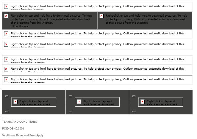
Due to the variety of options for viewing email, you should adopt a text-first strategy in designing them. This is similar to the new web designing standard of mobile-first. Since a mobile phone is currently the smallest screen size users can view a webpage on, mobile is considered the lowest denominator. Make sure it looks and works correctly on a mobile phone, and work up through the screen sizes. Similarly, since not all email clients show images, you should design from a text-first stance, and embellish with images where the loss of text will not inhibit your readers from viewing your entire message.
For example, a very simple text-first strategy may have this template:
- Message Body:
- Message [Text in the form of paragraphs, lists, and/or tables, along with links to calls to action]
- Signature or Closing [Text]
- Footer:
- University logo [Image]
- Contact Info [Text and links]
A more embellished text-first strategy may have this template:
- Header:
- University logo [Image]
- Main Call to Action Heading
- Message Body:
- Start of Message [Text in the form of paragraphs, lists, and/or tables, along with links to calls to action]
- Supplemental Graphic [Image and maybe a link to a call to action]
- End of Message [Text in the form of paragraphs, lists, and/or tables, along with links to calls to action]
- Signature or Closing [Text]
- Footer: Contact Info [Text and links]
In each case, the use of colors, fonts and infographics can be used strategically, making sure all images have appropriate alternative text.
Signatures / Contact Information
When providing contact information, it is better to use text than graphics because your users need to be able to access them (e.g. phone numbers, addresses, social media links) as much as they do your message’s calls to action.
References
Guides and How-To’s
- Tarleton
- Web Accessibility Initiative (WAI)
- Tutorials
- Designing and Developing
- Use headings to convey meaning and structure
- Make link text meaningful
- Write meaningful text alternatives for images
- Provide clear instructions
- Keep content clear and concise
- Provide sufficient contrast between foreground and background
- Don’t use color alone to convey information
- Ensure that interactive elements are easy to identify
- Create designs for different viewport sizes
- Include image and media alternatives in your design
- Use mark-up to convey meaning and structure
Guidelines
- WCAG 2.0 Guideline 1.1 – Text Alternatives
- WCAG 2.0 Guideline 1.3 – Adaptable
- WCAG 2.0 Guideline 1.4 – Distinguishable
- WCAG 2.0 Guideline 2.4 – Navigable
- WCAG 2.0 Guideline 3.2 – Predictable
Simulations
- User Simulation: Through Eyes of a Screen Reader
- LevelAccess
- Simulation: ZoomText Demo
- Simulation: Screen Magnification & Reflow in Acrobat Reader (also example of horizontal scrolling issues)
- Simulation: Effective Color Contrast
- Simulation: On-Screen Keyboard Demo
- Simulation: Readability
- User Simulation: Carly’s Café – Experience Autism Through Carly’s Eyes
- The National Autistic Society Simulation: Autism and sensory sensitivity