Fonts
Your eyes constantly scan the text in front of you to determine patterns from symbols to form meaningful relationships. Whether you have a low vision disability, a reading disorder, or no impairment at all, you can have the following problems reading text depending on font choice and spacing:
- recognizing character patterns due to font family (typeface) choice
- recognizing separate characters due to proximity and font family choice
- recognizing words putting all the characters together
With character location, spacing, and font choice all put together, you can have some confusing, if not embarrassing, results.
Best Practices
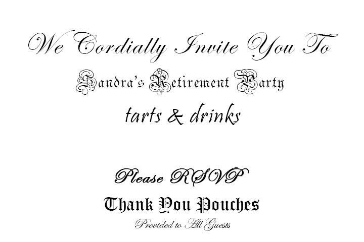
The text should read: “We Cordially Invite You To Sandra’s Retirement Party. Tarts & Drinks. Please RSVP. Thank You Pouches Provide to All Guests.”
The Invite example provide multiple issues that you should consider.
Avoid script fonts when possible
It is so easy to misinterpret script fonts given their embellishments and the increasing usage of computers for communication purposes. For example:
- Can the “C” in “Cordially” look like a “G”, the “I” in “Invite” look like a “J” or “T”, or the “P” in “Pouches” look like a “D”?
- Can you read the “S”, “R”, or “P” in “Sandra’s Retirement Party”, “RSVP” in “Please RSVP”, or the “G” in “Guests”?
For individuals with low vision or reading disorders, these are all potential misinterpretations.
Use one (1) script font only
If you are going to use a script font, use just one and in moderation. You want your users to be able to get the tone of your message (e.g. official, formal), but you also need it to function for them by allowing users to read the who, what, when, where and why, along with the how (e.g. RSVP information).
Everything else can be a serif font for some light embellishments and/or italicized looking font. Don’t use the italics format as this changes the meaning for screen readers as being emphasized ( the <em> HTML tag).
Don’t use more than three (3) fonts
You brain is constantly leaping between patterns to recognize, and this can overwhelm some users with information overload causing headaches and confusion. Two fonts is ideal, but three would be the maximum on any message. These can be used at different sizes to determine importance. With regard to programming formatting, you’ll want the fonts and sizes to be a part of the style sheet, so you don’t override size needs of low vision users who may not even see your font choices.
Choose font families (typefaces) wisely
To reiterate for the third time, choosing a font is a very important decision as it will reflect on the message. Sometimes, one letter in your message can make a word look completely different, like the morphing “t” into an “f” in “tarts”. Keep in mind, you knew the second time you saw the “t” that it was a “t”, but your brain may have interpreted the first one differently in order to quickly create a word. Our brains can do that with misspelled words.
Text should be large enough to be readable
This will depend on color choices and fonts, as well as what you are allowed to do on any platform. You cannot always change the font size. When you can, make sure your fonts are 12 point or higher. Where color contrast allows it, you should increase the font size to improve readability.
Text should be legible enough to understand
This includes choice of font as well as choice of background. Not all backgrounds are good for text. Backgrounds with patterns can make text illegible no matter what you adjust. Some do allow for adjustments, like bolding the font, increasing the font size and/or changing the color.
References
Guides and How-To’s
- Usability.gov’s Web Standards and Usability Guidelines
- Chapter 3: Accessibility
- Chapter 11: Text Appearance
- Chapter 14: Graphics, Images, and Multimedia
- Web AIM
Guidelines
- WCAG 2.0 Guideline 1.4 – Distinguishable
- Understanding WCAG 2.0 Guideline 1.4
- Techniques for WCAG 2.0 G96: Providing textual identification of items that otherwise rely only on sensory information to be understood
- Techniques for WCAG 2.0 G117: Using text to convey information that is conveyed by variations in presentation of text